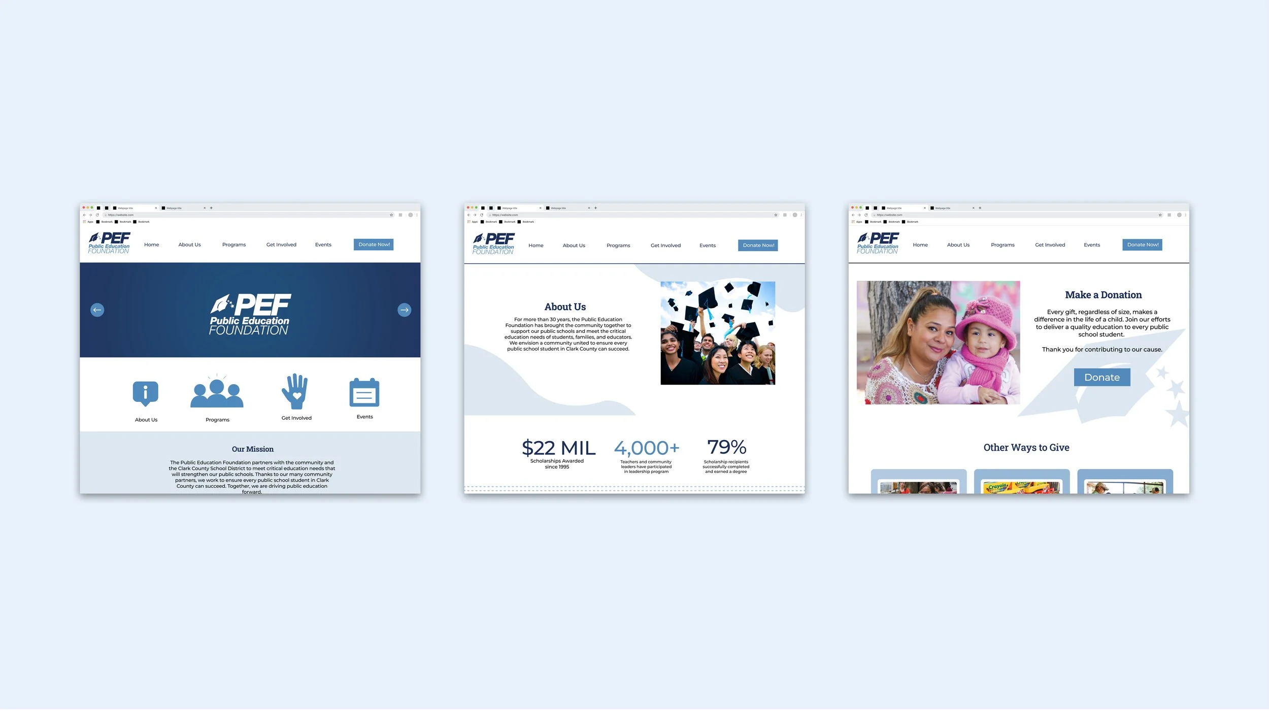
PUBLIC EDUCATION FOUNDATION WEBSITE REDESIGN
The Public Education Foundation is a non-profit organization in Las Vegas that strives to improve and enhance the quality of education in the Clark County School District. The Public Education Foundation (PEF) offers scholarships to students, leadership training programs for teachers, digital learning programs for families, shows for students in fine arts, and even a store where teachers can easily purchase school supplies for their classrooms at a low cost. The Public Education uses their website to convey their impact upon visitors and keep supporters updated with any new events they host.
Overview
Challenge: Make changes to the non-profits’ website and try to make improvements to design and organizational issues.
Solution:
Design a website that effectively represents the organization’s goals
Integrate designs in a way that appeals to the target audience, potentially influence them to become invested in the organization.
Role: UX/UI Designer
Key Skills: User Experience Design, User Research, Research Synthesis
Tools: Figma, Adobe Illustrator
Timeline: 2 months (Aug. 2020 to Oct. 2020)
The Design Process
Empathize
To start the redesigning process, I asked the organization’s design and marketing directors on what they believe are flaws in the current website as well as changes they believe should be made to the new one. By interviewing them, I was able to gain a clearer understanding of what they wish to achieve with the organization’s website as well as professional insight on how to design/market better. The flaws they pointed out and their personal suggestions are listed below.
Research Goals
Discover the existing problems of the website that the staff already knows of
Ask the staff what they would like to keep in the newer website
Interviews with staff
After gathering all my feedback, I created user personas to create a mental picture of what kind of users the Impactful app may have, and what they may want out of the app. I created personas for 1 volunteer and 1 organization representative.
Deborah Sobaszek - Director of Multimedia and Graphic Design
Problems: Too much information on homepage; needs to be more simplistic and minimal, navigation bar needs to be condensed to only a few things
Things to keep: Sponsors should still be on homepage, impact matters information should still be highlighted
Riley Caspersen - Director of Marketing and Communications
Problems: Needs to have a cleaner and organized interface, does not emphasize donation as much as it should, focus of website homepage is not clear
Things to keep: Most text on each page should stay (still be used somewhere but can be moved around), keep using a lot of pictures and add more icons if necessary
Define and Ideate
On top of the problems mentioned by the staff, I also analyzed the website myself and defined the kind of major problems the website had. I ensured to keep both the problems the staff identified as well as the ones I identified myself in mind while coming up with the site’s layout.
Defining the Problem
Inconsistency with colors and font
The website does not use the brand colors of the PEF and instead uses different shades of blue across the webpage. The website also mainly utilizes only one font, Arial.
Mission is unclear in the homepage
Upon visiting the homepage, the mission of the organization is not clear. It mainly caters towards people that already know about the organization.
Does not effectively display the different programs offered at the Public Education Foundation on the homepage (only showcases one)
The Teacher’s Exchange program is the only one that is shown on the homepage. This miscommunicates the idea that the teacher’s exchange is the most important program, or the only program that matters most over the others, when instead all programs are valued the same.
Solutions
Incorporate brand colors and a diverse (yet selective) set of fonts
This will be more aesthetically pleasing to the visitor of the website, make the website unique to the organization, and perhaps keep them more intrigued to stay on the website.
Make the website more organized and selective
This solves the issue of mission unclarity and any potential navigation trouble the visitor may come across while looking through the website.
Information Architecture
Prototype and Test
On top of the problems mentioned by the staff, I also analyzed the website myself and defined the kind of major problems the website had. I ensured to keep both the problems the staff identified as well as the ones I identified myself in mind while coming up with the site’s layout.
Low Fidelity Wireframes
Low Fidelity Wireframes
Takeaways and Next Steps
As this was my first ever UX design project, there’s much more I can improve. Next time, I want to interview with actual users of our website, rather than just internal stakeholders. I also want to spend more time understand more effective ways of user research rather than just competitor analysis and asking internal stakeholders for feedback. I also want to learn how to fully prototype a product and test that as well.
Overall, this was a great first time exercise and I look forward to redoing this again, accomplishing what I’ve stated above, and helping the Public Education Foundation push their agenda further!


